


Having a website for your company is like having a billboard on the side of the highway.
For many it’s going to be the first thing they see of your business, and they’re going to decide whether they want to see more based on that initial impression. If someone reaches your website and doesn’t like what they see, it doesn’t matter how good your product or services are, they are likely to navigate away from your page.
So, much like that billboard trying to get you to make an exit on your trip, making sure that your website is inviting, attractive, and most importantly, easy to read is going to entice more people to give their attention to your website. This is where having good UX, or user experience, comes in.
Its important to take UX seriously, as it can have serious effects on your marketing efforts, especially in this age of constantly changing digital trends and search engine refinement. Thankfully, most times it doesn’t mean totally overhauling your website, but there are certain best practices that should be considered. We’ve made a checklist of some of the most important things to watch out for when considering how your website’s appearance impacts your visitors.
Building Towards Better UX
Make on-boarding to your landing page easy.
One of the quickest ways to have someone bounce off your website is to have people come to your website and have the landing page be poorly executed. In many ways your landing page is the first impression of your first impression, which is to say that it is likely to be the very first thing anyone sees of your brand. So, you want to make sure that it’s a nice page to look at.
One of the quickest ways to make a negative impression on someone is to have the first thing they see be a website loading bulky content with very little in the ways of actual user engagement. Kind of like when you see something that’s all flash and no substance, your audience is going to be quick to get frustrated if they can’t figure out what it is they are looking at.
Now, there is no one right answer on how to make your landing page pop out and shine. After all no two companies are the same, and their identities are going to vary as a result. However, communicating your vision, values, and services are things that should be at the forefront of your design. Even if you are selling mystery items from your website your landing page should engage someone in that mystery.
Visuals are also massively important. Do you want to have animations? Is your design aesthetic going to be something minimalist and use a lot of white space? What if any interactivity will there be? These are just a few questions to consider when looking at your landing page, but they are all important ones when factoring in how you are presenting yourself.
You also want to make sure your website is quick to load. We’ll talk about this a bit more later, but the longer your landing page takes to present the information on it, the more likely someone is to leave.
Learning to love white space.
Attention is becoming something of a rare commodity online these days. With the amount of content we have at our fingertips, even the most focused person can become distracted by any number of things on the internet. This makes designing your website tricky as you want it to be engaging and attractive, but also a place that keeps people focused on your offerings, whatever they may be.
This is where white space, or negative space comes in. While it may be tempting to use every bit of empty real estate on a website to advertise and promote other services, in many cases it is wiser to hold off on doing so.
Giving your content space to breathe and keep the user’s eye focused on it is a simple step that can vastly improve how people interact with your web pages. Especially on something like a blog post, minimizing distraction is important. You want your website to be legible and to be something that invites people to stay longer, and oftentimes that means keeping things simple.
Use of white space can also be a helpful tool for drawing and directing a visitor’s eyes to certain content you want to focus on. If used effectively, you can build a rhythm with how a page’s layout is setup that directs people to your content and feeds them into staying on your website longer.
However you choose to use it, always make sure that its in service to your website and your brand as a whole. Just like with having too little white space, there is such a thing as too much of it as well.
Text formatting and hierarchy
Text hierarchy is the means by which content is distinguished to denote importance, or sections. Reading this article, or any article in the past decade really, you’ve probably already noticed this even if you didn’t know what it was called.
There are familiar labels that can be applied that can help establish a visual distinction to help readers understand content structure.
- H1: Usually reserved for titles, they are typically the largest block of text on a blog post
- H2: Your headings, which typically summarize the main point of the article section.
- H3: Sub-headings to break that main point down
- Body text which is the bulk writing for a blog or article.
These help your reader to better understand and focus on what they are looking for in an article, as well as help to break up content into chunks, kind of like the chapters of a book. Additional text formatting like bullet points can also help create quick focus, as often times viewers are scanning for specific pieces of information.
It also helps to utilize things like height, weight, color, position, and font contrast to further establish visual hierarchy and make that information easy to parse. The easier you make it for people to get what they need, the more likely they are to want to keep coming back for when they are looking for that specific thing, or something similar in the future.
Keeping visual consistency
It doesn’t matter if your website has the most beautifully designed pages in the world if no one can figure out where things are on them page to page.
When designing your website, try to establish some common conventions, and make sure that you keep things consistent. While it may be aesthetically pleasing to have a totally unique website layout, there are certain choices that have become standard, and are worth following to make it easier on visitors to your webpage to keep their attention focused on the things that matter.
- Navigation menus placed at the top right, or top center of a webpage.
- A contact link or button included within the navigation menu
- Logo placement in the top left, usually one that links back to the website’s front or landing page.
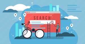
- A search feature located in the header for easier site navigation.
- Social media links in your footer along with sitemap and various links that are less frequently accessed.
- Signup for newsletter or other feature in the footer.
If you choose not to utilize these conventional layout habits, consider what is gained by changing them. It is still important to have your website have its own identity after all.
Likewise, it is not mandatory to have every page on a website adhere to these formats. Having small changes and variations can work to your benefit in keeping things visually engaging. By utilizing a few anchor details to ensure visitors know where they are on a website, you can make those creative choices to keep things from getting too boring.
Gaining better follow through with attractive calls to action
So you’ve gotten your website built, it looks nice, the content is excellent, but now you have to get people to follow through with your service or product. While much of the heavy lifting has already been taken care of, a call to action (CTA) can function like a tugboat to get you the rest of the way.
Using strong action words with clearly marked links or buttons makes it easy and exciting for users to answer that call, rather than ignoring a button with plain wording. Choose your wording carefully when implementing your CTAs as typically, there will not be a lot of space to utilize. A good example of a call to action would read something like “Sign Up Now!” compared to something that says “Click Here” that doesn’t engage or create any emotional connection in the user.
Where possible, try to have a button rather than a link to maximize the visibility and presence of your call to action so that people are more likely to notice and click it.
Optimize site performance and mobile friendliness
People like getting things fast. Nowhere is that more true that online when people are browsing websites. Long loading and hang times can be a death sentence for a website. The longer it takes for a page to load, the more likely people are to bounce from it. And if people are constantly leaving your site after such a short period of time, the more likely you are to be ranked lower in search.
This also applies for mobile. In fact, its arguably more important that your site be optimized for mobile-friendliness as Google penalizes sites that do not perform well in that area. More and more people are utilizing search functions and browsing the internet on their phones, so ensuring that your website can properly scale to different screen sizes and types can help provide a genuine benefit and boost to your site’s performance.
Thankfully, most website designs these days will scale automatically, but it is still handy to check and make sure that your pages look good across all formats.
In Conclusion
Its easy to speed by websites as you’re looking for what you need. Slowing people down to better understand and become better attached to your company is going to be an ever changing, constant process.
Your website UI needs to be something that allows people to focus on your brand, your content, and ultimately whatever goal the website is trying to get across. Whether you’re just designing it, or looking to overhaul your current page layout, think carefully about what you are implementing and communicating to your audience. If people send feedback, take that into account, and adjust to address those concerns.
Taking care of these steps can ensure that your website has exceptional UX and let that billboard become a rest stop for people traveling those digital roadways.